0
Skip to Content
About Sofia
sofia martins design
About Sofia
sofia martins design
About Sofia
NUA-Posts-01.gif View fullsize
Nua-01.jpg View fullsize
Nua-02.jpg View fullsize
Nua-03.jpg View fullsize
Nua-04.jpg View fullsize
Post-08 copy.jpg View fullsize
Post-07 copy.jpg View fullsize
Post-09 copy.jpg View fullsize
NUA-Posts-01.gif
Nua-01.jpg
Nua-02.jpg
Nua-03.jpg
Nua-04.jpg
Post-08 copy.jpg
Post-07 copy.jpg
Post-09 copy.jpg
  • nua Restaurant

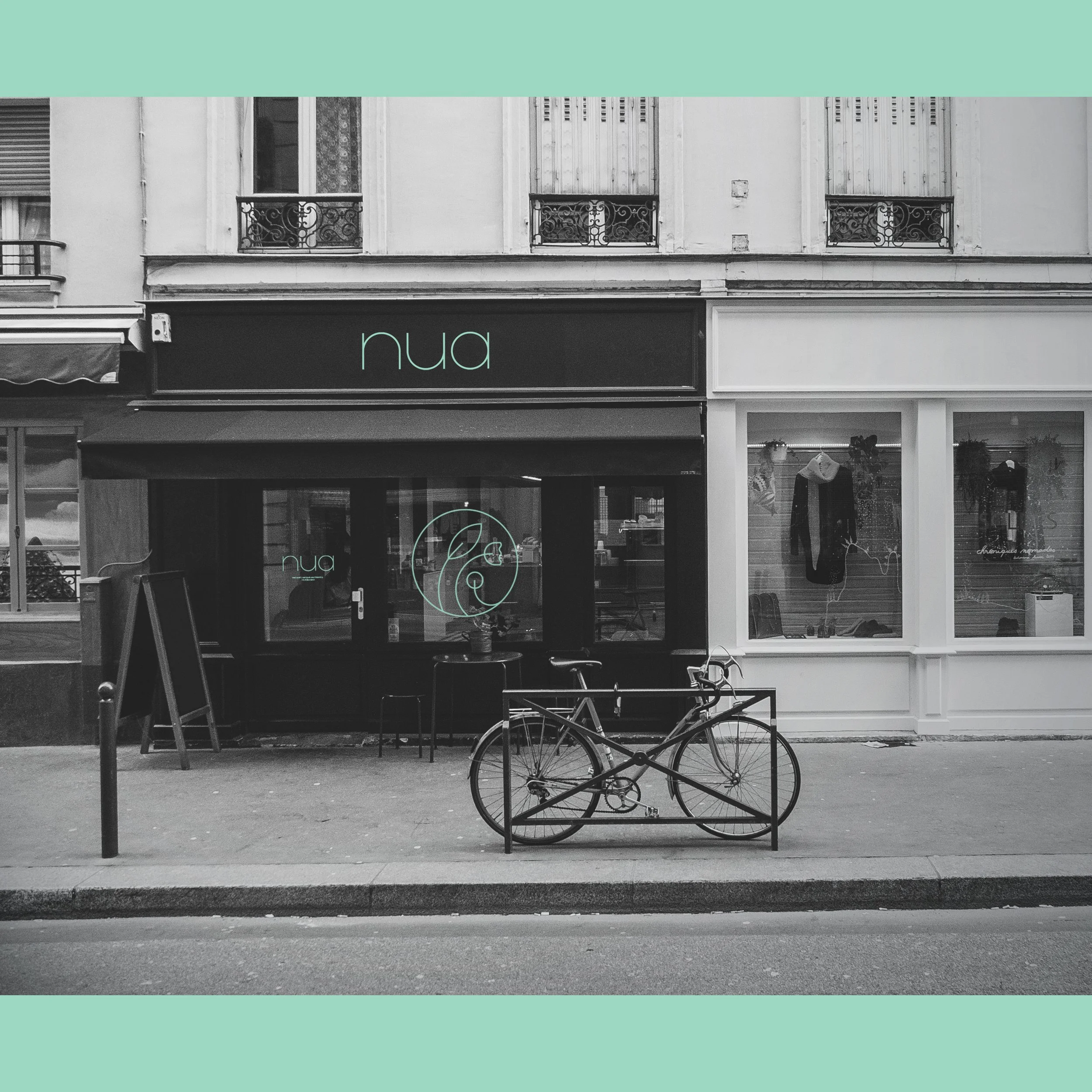
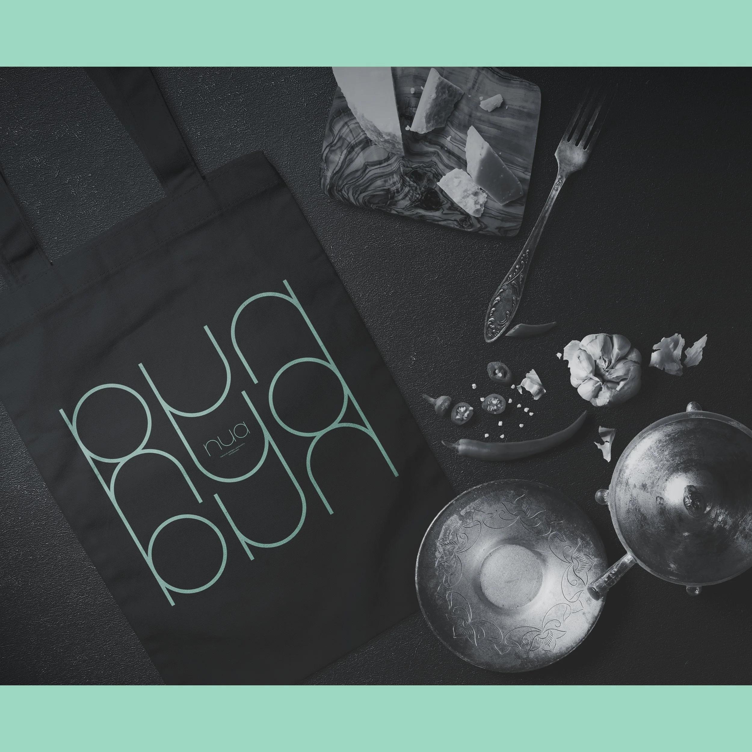
    “nua” is a bio food restaurant located in Funchal, Madeira Island, offering dishes made with unique local ingredients. Its main audience consists of travelers with a young spirit — curious explorers eager to discover authentic local flavors. In Portuguese, nua means “naked.”

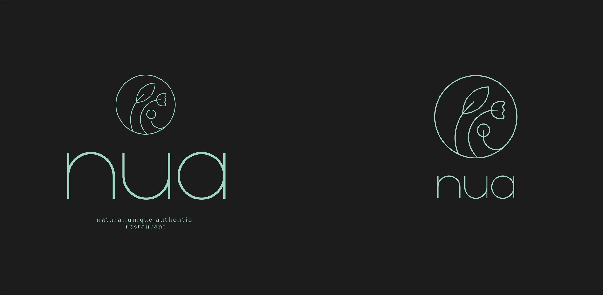
    The visual identity reflects this concept: natural, bare, and simple — just like the restaurant’s dishes, which honor the authenticity of each ingredient while adding an original touch. The logo typography was developed to embody this simplicity. The icon draws inspiration from three organic elements that recall plants and flowers. Each one represents one of the brand’s core values: natural, unique, authentic — n-u-a.

  • Rebranding / Visual Identity

  • Visual Identity / Packaging

  • Editorial

  • Visual identity

  • Visual identity

  • Visual Identity

  • Visual Identity

  • Personal Project

  • Visual identity

  • Visual identity

    Illustration – Rise in love

    Illustration – Sing while you may

  • Visual Identity

  • Visual Identity

  • Editorial

  • Visual identity

  • Flyer

  • Visual identity

  • Logo Collection

hello@sofiamartinsdesign.com

Instagram

Linkedin